Cancer Incidence and Mortality in the United States: An Exploration
These days, I frequently hear about people getting cancer. I have wondered if cancer is becoming more common or if perhaps people are just more open in talking about it. Some other questions I've had about cancer include: are certain races more affected than others? Is cancer more common among men or women? What types of cancer are most common? And how does this vary by gender? Also, with all the new treatments available, is mortality from cancer decreasing? This set of ggplot2 plots explores these questions.
First, we can look at how cancer incidence and mortality has evolved over time for both men and women.
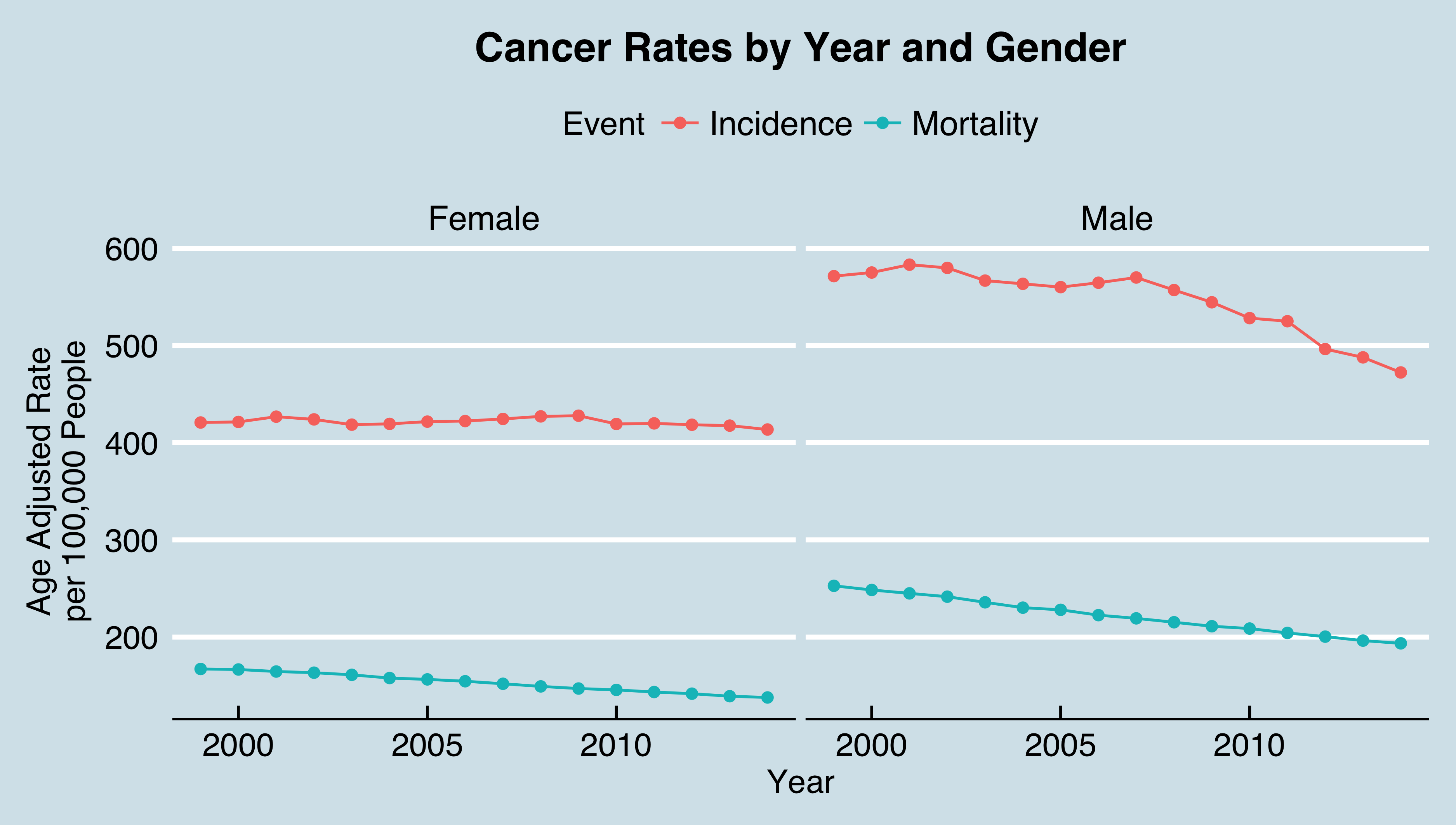
We see that between 2000 and 2014, men have had higher cancer incidence rates than women. The incidence rates for women have stayed roughly level over time with a little over 400 new cases per 100,000 women each year. For men, though, cancer incidence has decreased during this time period from more than 600 new cases per 100,000 men each year to below 500 new cases per 100,000 men each year.
Mortality rates are also higher for men than women; for both men and women, the mortality rates have decreased over time in a remarkably linear fashion, suggesting that new treatments are helping people survive cancer.
Next, we can look at cancer incidence and mortality by gender and race for the most recent year for which we have data, 2014.
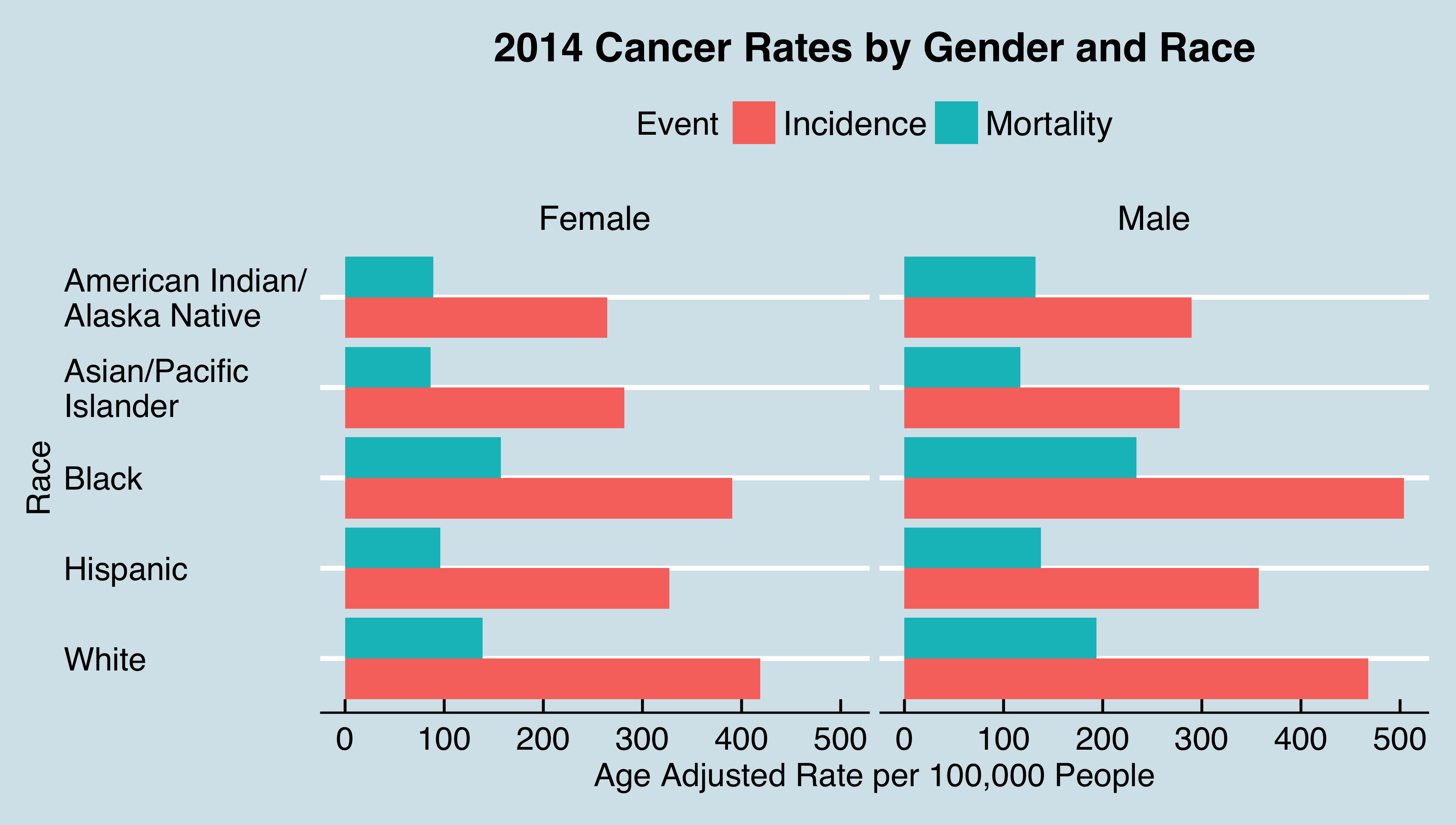
Among men, black men have both the highest cancer incidence rates and mortality rates of all the races. For women, though, white women have the highest cancer incidence rates, but black women have the highest mortality rates. In a more granular analysis, it would be interesting to try to determine why both black men and black women have the highest mortality rates. Does this have to do with systemic injustices such as lack of access to good health care and siting of polluting industrial facilities in heavily black neighborhoods, or is this simply about genetic predisposition?
Finally, we consider the types of cancers affecting different genders.
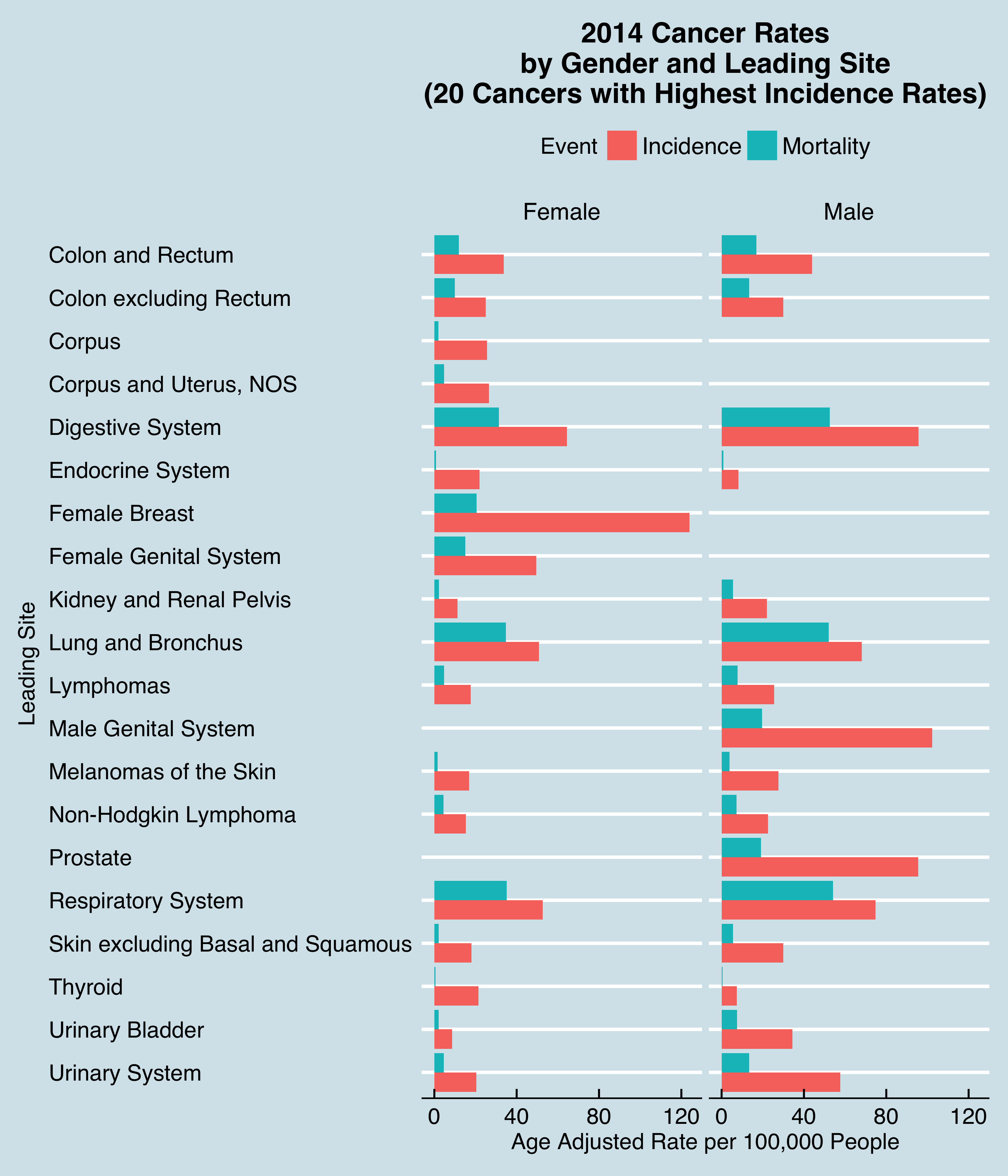
For women, breast cancer is by far the most prevalent. For men, the most common leading sites are the male genital system, the prostate, and the digestive system.
This is an extensive data set, and these visualizations provide only a very preliminary exploration of this data that enable us to start thinking about what other questions we might want to ask about this data.
References
The clean data for this visualization is available here. I downloaded this data from the Centers for Disease Control and Prevention (CDC) website. The code for producing each of the three individual plots is on my Github site.